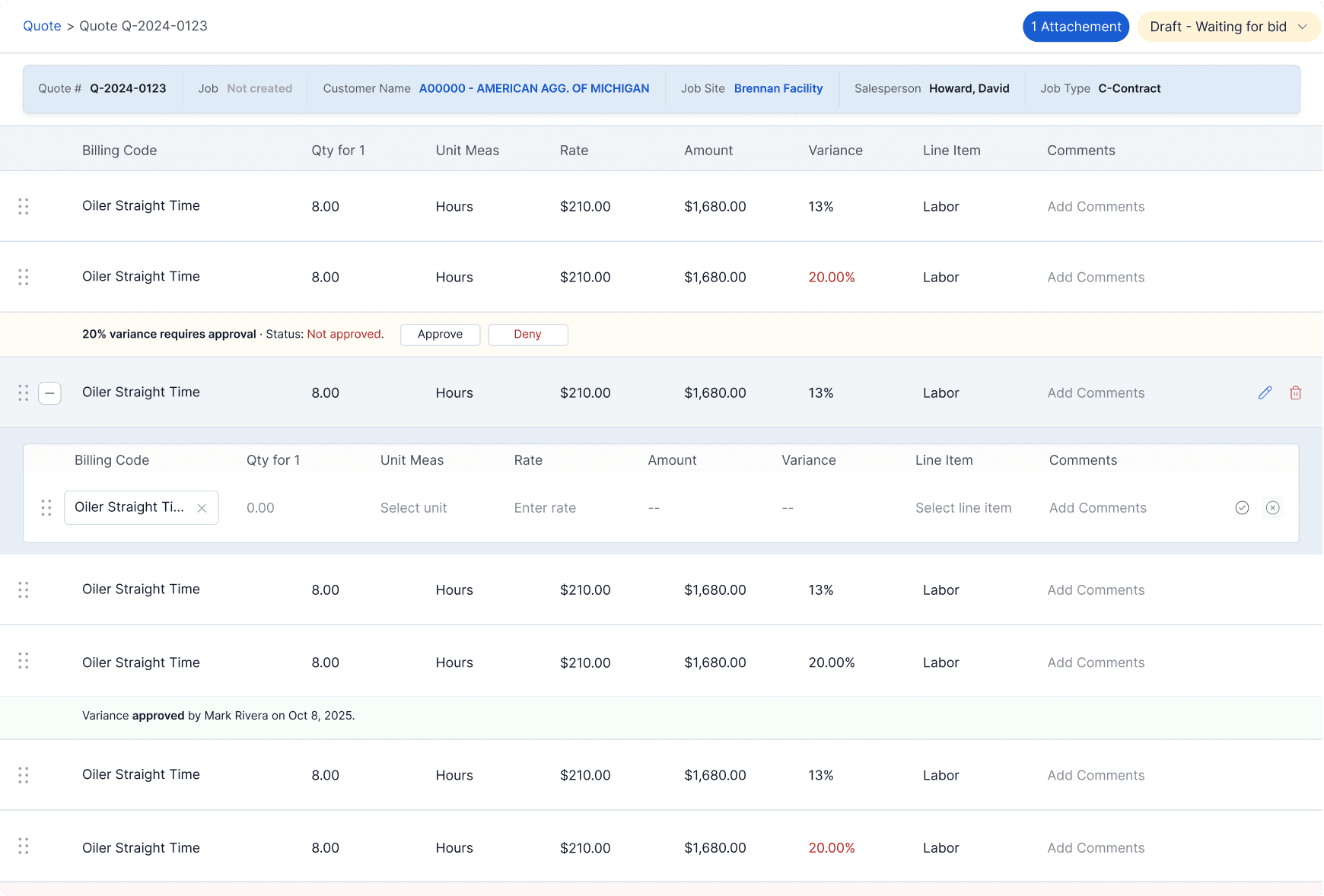
QUOTE LISTING / BEFORE AND AFTER
The design brief consisted of 7 hours of recordings, screenshots of a failed redesign, and a legacy platform designed circa 2005. This was followed by tight deadlines and many unanswered questions. A theme of the project was ‘we need this now.’
Fleet, Cost & Care is a fleet and maintenance management company out of America’s Midwest. The project consisted of the original stakeholders, 20 developers, and me. I was the product designer, the UX strategist, and the product manager all in one.
The real issue was that it lacked any semblance of information hierarchy. The user had clearly not been taken into consideration and because of that, the system architecture was a haphazard jumble of fields, popups, and endless meandering user flows.
The solution started with a dissection. Slowly piecing through the seven hours of recordings, noting user pain points, key flows, and repeating patterns. Next was putting together a rough map of how everything fit together, then optimizing those patterns for the user. Key screens were then broken down into their smallest parts and rebuilt based on clear logic. The visual language came last, designed to bring calm and order to a system built on chaos.
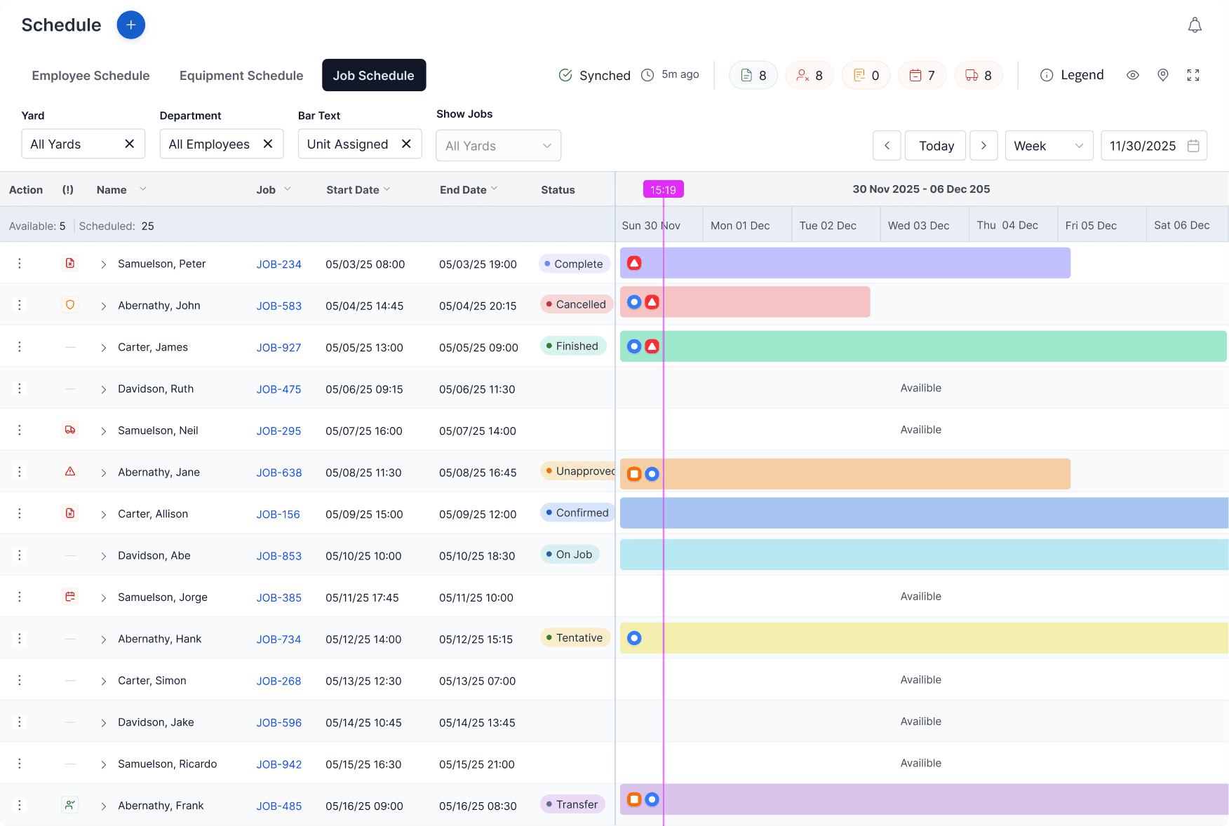
SCHEDULE DESIGNS
It combined three schedule types (employee, equipment, job) with a split screen listing and schedule model. The original screen was rife with random icons and unexplained color systems. First the structure was built so the listing could coexist with the schedule blocks without causing visual chaos. Next, the design language was built from scratch: 8 job statuses, 14 icon indicators, 3 bar statuses, 3 status markers, 3 e-ticket statuses, all organized into a proper legend system.
The quote screens were an excellent example of what exactly was wrong with the platform. They acted as a pattern for many of the other features, yet there was no clear organization. The challenge was to reorganize the flow by user logic, while adhering to dev constraints, and appeasing the power users. The solution was structural. A column grid to impose order, inline editing to reduce context switching, and a sticky header so users never lost their place.

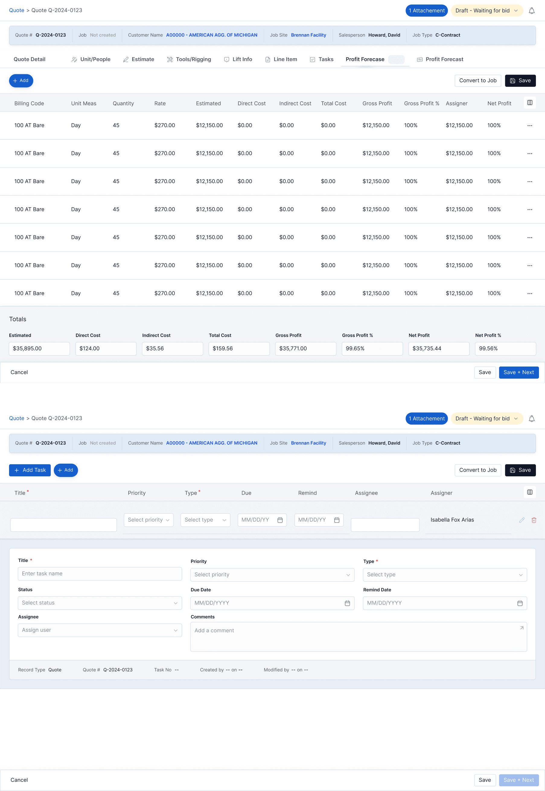
QUOTE DESIGNS
Compared to the previous delivery, which was a year and a half in the making, the final delivery was made in 3.5 months, mid September to mid December. The client was thrilled and continued to say what a great improvement it was on the original.
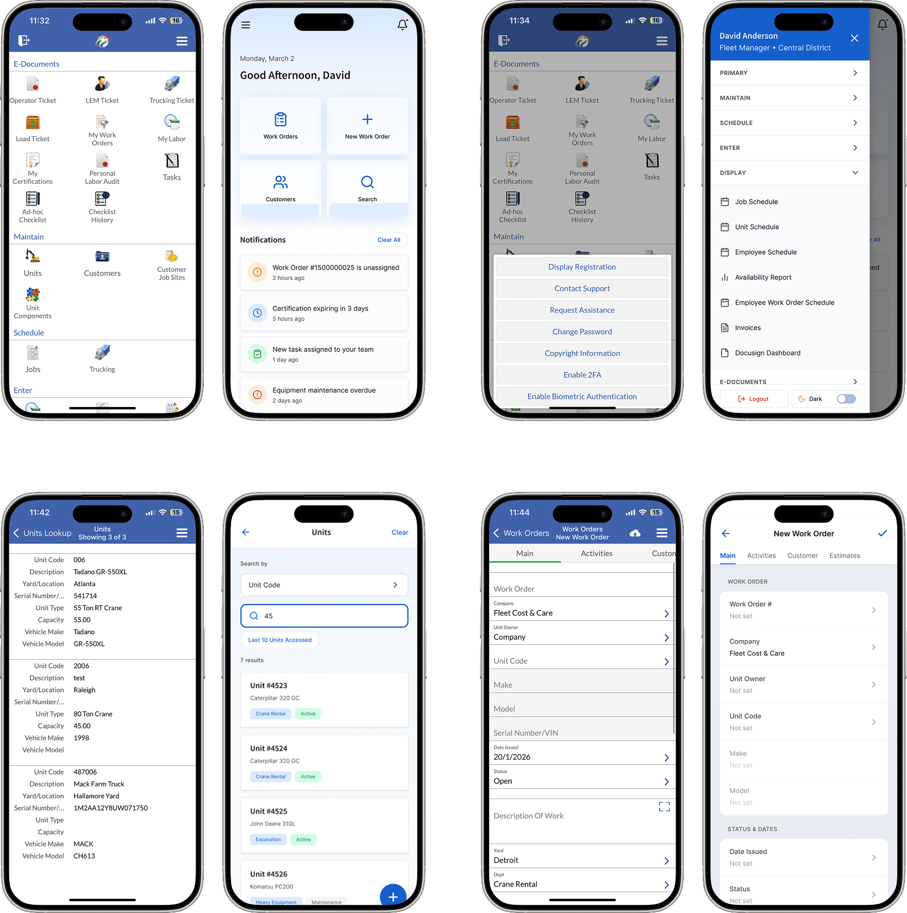
MOBILE DESIGNS - BEFORE/AFTER